Brand and experience
Let visitors explore information on interactive screens
A customer comparing products may want more detail than a rotating playlist can provide. They might be interested in one product's specifications while the next person wants to explore a different category. An interactive screen lets each visitor choose what to look at, instead of waiting for the relevant information to appear.
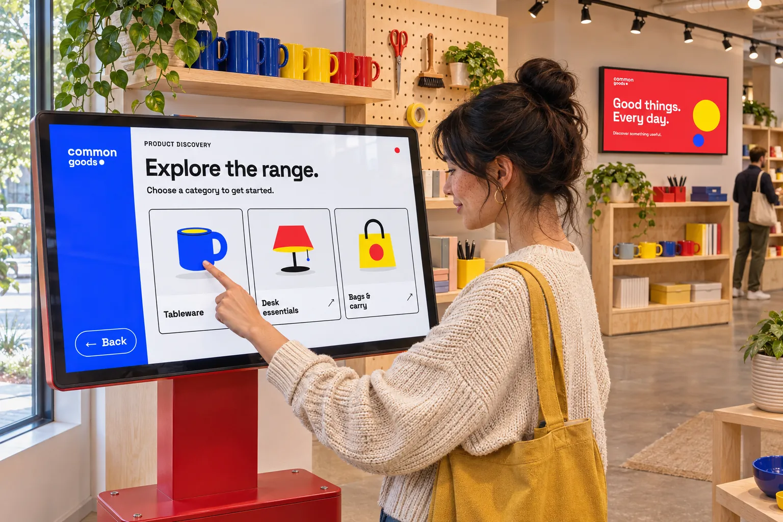
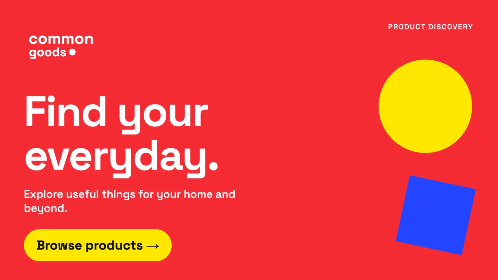
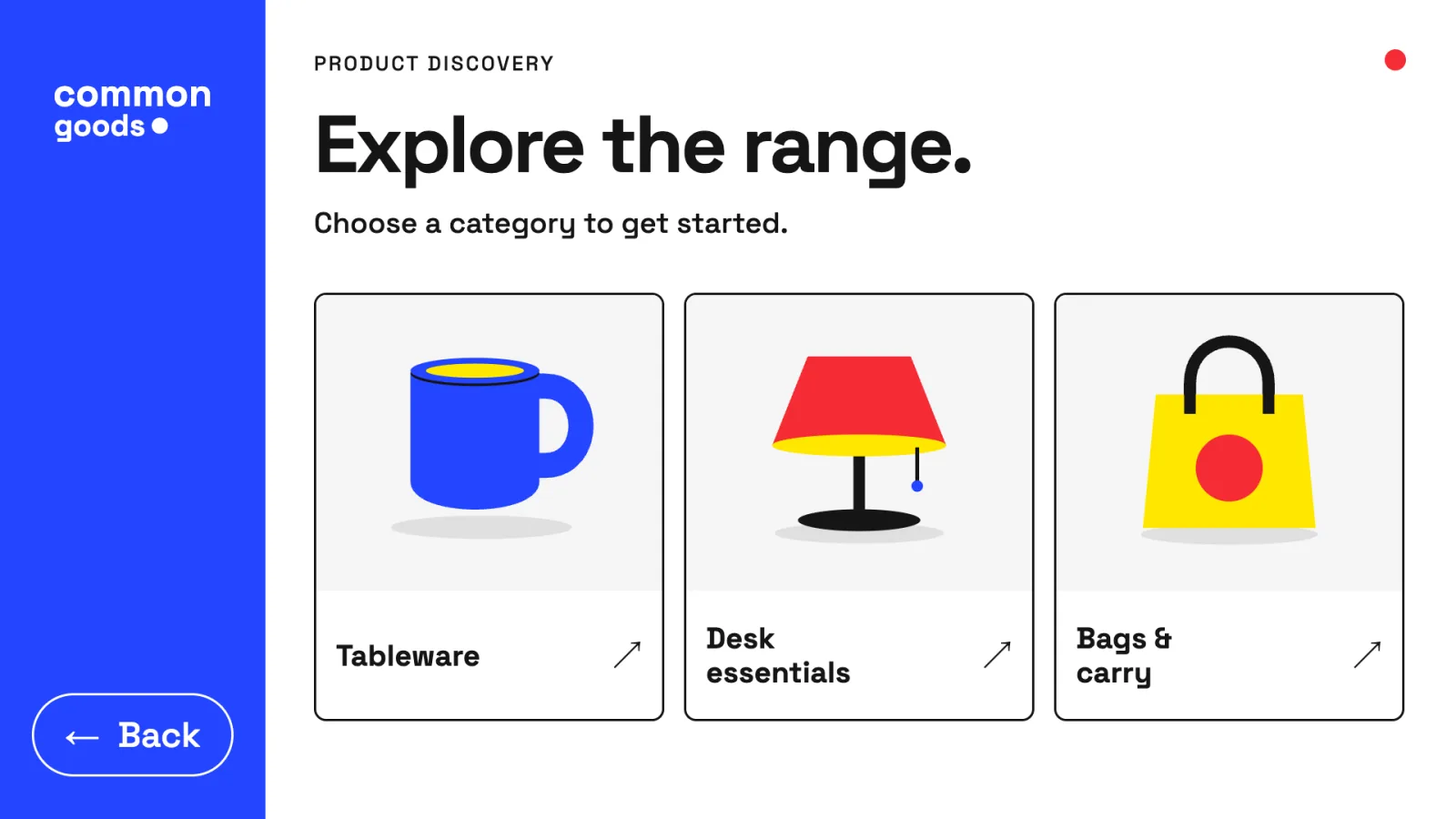
Consider a retail display that begins with a welcome view. A tap opens the store's product catalogue, where the customer browses categories and opens the products that interest them. A Back control returns to the welcome view. When the customer walks away, a configured inactivity response restores the starting view for the next visitor.
That complete journey is what makes the screen useful. People need to recognize what they can select, understand the response, and find their way back. A design that reveals details but leaves the next visitor on an unfamiliar page has only solved part of the problem.
Open the product pages you already have
Product information usually lives in another system already: a web shop, an online catalogue, or a web app built for browsing the range. The screen does not need a second copy of it. Smartsign can show the existing page, and the screen's design decides when it appears.
The page is added to Smartsign as webpage media. Choose Live playback for this use. The page then runs in the player's browser, where visitors can operate it, and product changes made in the source system reach the screen without republishing anything. Snapshot playback shows a periodically refreshed image, which cannot be browsed. A live page has to be reachable from the player and work in that device's browser, so try it on the intended player before designing around it. If the page requires sign-in, restricted-access web pages explains what to establish first.
The welcome view and its controls belong to a template, created in Template Creator, where a design is arranged in layers. The webpage is one of those layers, hidden at the start, and the design connects events to the actions that decide which layers are visible:
| When this happens | The design responds by… |
|---|---|
| A customer selects Browse products | Hiding the welcome view; showing the webpage and a Back control. |
| They select Back | Hiding the webpage and the Back control; showing the welcome view. |
| The configured inactivity period passes | Restoring the starting view for the next visitor. |
Whether browsing inside the page counts as activity depends on the player. Confirm on the intended player that the page stays open during a visit, and choose the inactivity period with that in mind.
Everything between opening and closing happens inside the page: categories and product details use its own navigation. The template can show or hide the webpage, but a tap inside the page cannot start a template action, so Browse products and Back are separate layers, such as a shape or an image. The player also draws the webpage in front of the template's other layers; place the Back control beside the page, not on top of it.
- Welcome view
- Catalogue and Back
- Back to welcome
Each response must be configured in the design; adding a button or a webpage layer does not create the interaction on its own. Create an interaction explains how to connect the first control to its response.
The playable content created from a template is smart media. A reusable template lets you adapt the information or branding for another location while retaining the interaction design.
Build other views into the design
Not everything a visitor asks for needs an external page. Opening hours, a current offer, or a store map can be layers in the same template, and the same kind of connection reveals them: one control shows the layers, and Back hides them again. A single control can also toggle a layer between visible and hidden. These views are maintained in the same system as your other screen messages, with no separate tool to keep up to date.
Some designs also need several responses to follow the same condition. An on/off state can coordinate them: changing a campaign state, for example, can show its layers and hide an alternative.
If participating templates share that state, an offline player will not receive new values immediately. Check the starting value and what happens when connectivity returns, and arrange the separate access needed to manage shared states. Use a local state for one template, or a global state for a condition shared by participating templates on the same site. Preview uses authored defaults locally; test shared values on the installed players. The Interactions guide introduces states and their event-and-action connections.
Use the same approach for directions and services
The choices on the screen should reflect what people came to do:
- Find a service: at reception, a visitor could select a service to reveal the relevant instructions.
- Find a destination: in a public building, a directory or map could let someone choose a destination and display the corresponding view.
- Choose a language: a selection could show one set of text layers while hiding the others.
These are different applications of the same idea: let people ask for the information they need at that moment.
Choose how visitors will make a selection
The input device should suit the visit. A touch screen can offer visible choices; keyboard controls can provide the same service, language, and navigation choices for views built in the template. A web page is operated through its own controls, so check that the product pages are comfortable to use at the screen's size and with its input device.
A lift-and-learn retail display could respond when someone picks up a product, but this needs an input device that sends a key press, or an integration that calls a Webhook data source's URL. The template cannot detect the product being lifted on its own. Agree how that input will reach the screen before building around it, then test the response with the actual hardware.
These examples begin with a visitor's choice. If the screen should instead respond to an alarm or business condition reported by another system, use a separately prepared external-event response.
Decide when visitors can use the controls
A product presentation can be one item in a scheduled playlist, with interaction available while that item plays. Publish its smart media in a booking for this use. The item's duration and booking schedule still apply: showing or hiding a layer does not extend its playback. Allow enough time for the intended visit and check what happens when the playlist advances.
If visitors should be able to use the screen's interface throughout normal playback, assign the smart media as a screen layout. This suits product browsing, which seldom fits a playlist item's fixed duration. The layout can include a Channel area—a part of the display that plays booked content—alongside the interactive views. For example, the screen could show promotional messages until a visitor opens the product catalogue.
When the catalogue or another information view replaces a Channel area, have the interaction hide that playing area and restore it on return. For a view built from ordinary layers this is required: putting such a layer above the channel placeholder in the editor will not cover its playback. Use an ordinary layer as the control; the Interactions guide lists which layers can start a click event.
Check the visit on the installed screen
Save and preview the design, then try the whole journey on the intended player and input device:
- Can someone recognize how to begin, explore the information, and return to the start?
- Does the product page load on the player and respond to the screen's input device?
- Does the design respond as intended to repeated input?
- Does the page stay open while someone is browsing, and does leaving the screen idle restore the starting view?
- Does the next visitor see the page's opening view instead of the product the previous visitor left open?
- For a playlist item, does playback advance to the next item as intended? For a layout, does normal channel content return?
Before handing the screen over, agree who can maintain the interaction design, who will publish the content or assign the layout, and who looks after the product pages in their own system. The Smartsign tasks require their respective access. Authoring interactions needs the Interactions permission; see the Interactions guide.
For related applications, browse the other use cases.